Projeto S.O.S
App Design
S.O.S is a mobile application designed to centralize access to public healthcare services, bringing together care guidance, appointment scheduling, medical history, and nearby facility locations into a single experience. The project addresses a structural issue of misinformation and improper use of services by proposing a clear, accessible, and well-organized interface that supports fast decision-making, especially in urgent situations. By integrating guidance, access, and records into a continuous flow, the app transforms a fragmented system into a cohesive, efficient, and citizen-centered digital experience.

Context
The project began with the goal of understanding the main challenges faced in the daily operations of public healthcare units and hospitals in Curitiba. We initially hypothesized that the primary issues were related to poor management and long waiting times—common perceptions when discussing the public healthcare system. However, before defining any direction, we chose to validate this assumption through exploratory research with professionals working directly on the front line of care.
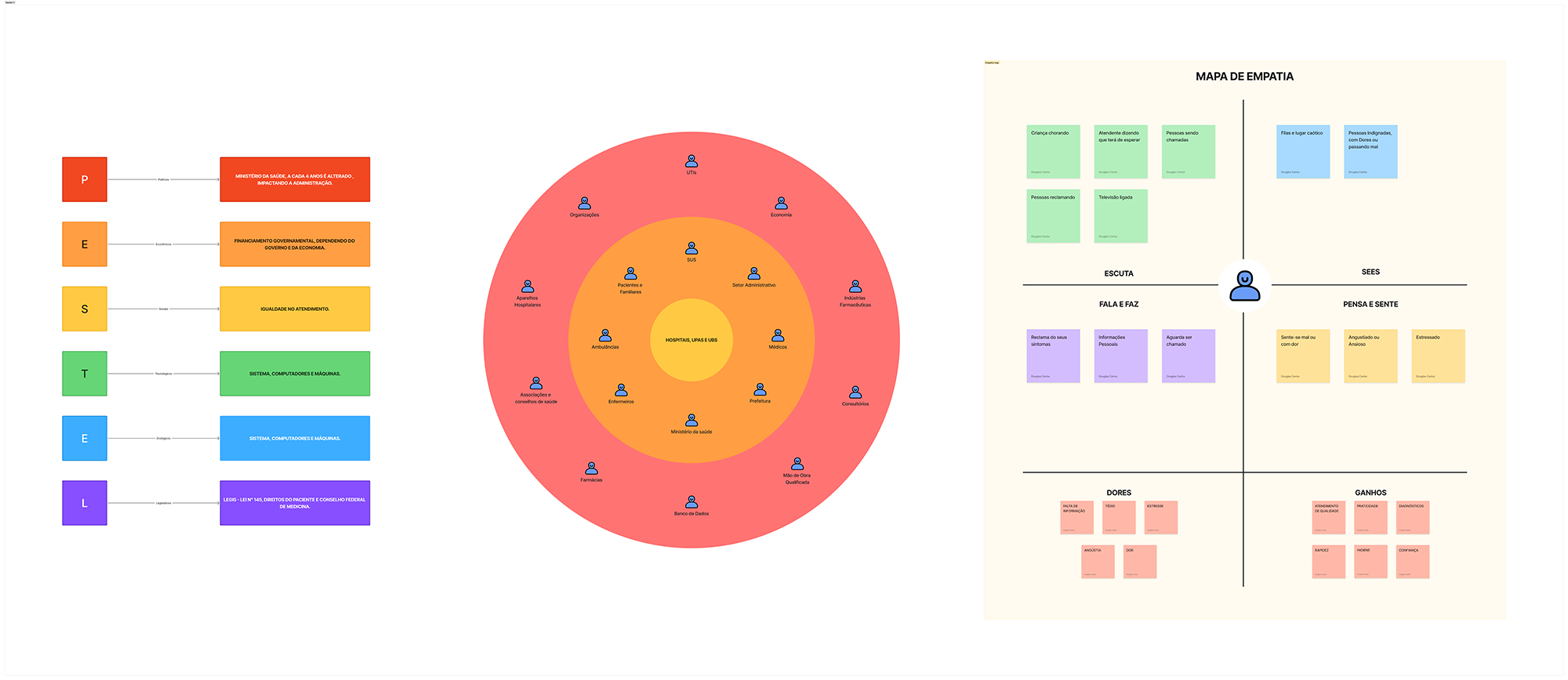
Before starting field research, we analyzed the healthcare system from a macro perspective, seeking to understand the external factors that affect its structure, operations, and service capacity. We applied the PESTEL framework to map political, economic, social, technological, environmental, and legal influences shaping the public healthcare context in the city.
In parallel, we conducted a broad mapping of the public healthcare ecosystem to understand how the system is organized, who its main actors are, and where structural frictions might occur. We identified stakeholders such as health authorities, municipal administration, hospitals, emergency care units, primary care clinics, doctors, nurses, pharmacies, pharmaceutical industries, data systems, and health associations and councils. We also mapped operational elements such as funding, workforce management, qualified personnel, medical equipment, and information systems. This overview revealed a highly interdependent system, with multiple touchpoints and decision-making processes distributed across different administrative levels.
In addition, we outlined an initial macro view of the patient journey—from service discovery, arrival at the unit, ticketing, and pre-care, to diagnosis and referral. Along this flow, we identified recurring emotions such as anxiety, uncertainty, urgency, and frustration, as well as pain points including long queues, lack of clear information, and unnecessary travel between facilities.
Finally, we developed an empathy map to better understand user behavior within this context. We observed that patients are often in a state of physical or emotional vulnerability, require clear guidance, and seek fast resolution to their needs. However, they frequently encounter chaotic environments, unclear communication, and uncertainty about which service they should use.
Insights
We conducted interviews with medical residents and nurses to understand operational bottlenecks, recurring difficulties, and their real impact on patient flow, and identified the following points:
- Lack of equipment
- Structural limitations
- Dependence on public funding and government policies
- Equipment that is broken or lacks proper maintenance
- Patient misinformation
- Confusion between primary care units (UBS), emergency care units (UPA), and hospitals
- Incorrect use of healthcare services
- Overload of emergency units
- Unnecessary travel and waiting times
Based on these insights, we refocused the project on designing a solution that guides citizens in a clear, accessible, and reliable way, helping them understand where to go, when to seek care, and which service best fits their needs. By improving access to information and restructuring the early stages of the decision journey, the solution aims to reduce systemic friction, prevent unnecessary demand on emergency services, optimize healthcare professionals’ time, and deliver a more efficient, humane, and trustworthy experience for people navigating the public healthcare system.
Problem statement
After mapping the healthcare system and conducting interviews with healthcare professionals, it became clear that the main bottleneck is not limited to infrastructure or management, but is primarily related to the population’s lack of information about how to properly use the available services.
Most patients are unable to distinguish between primary care units, emergency care units, and hospitals, and do not understand which types of cases each facility is designed to handle. This lack of information leads to unnecessary travel, overload in emergency services, and longer waiting times, directly affecting both system efficiency and the user experience. The problem is not only operational, but structural within the patient’s decision-making journey. The opportunity identified was to act at the very beginning of this journey, at the moment when users decide where to go in urgent or emergency situations.
Proposed solution
The proposed solution is a mobile application that provides care guidance, appointment scheduling, medical history access, and nearby facility location. The app is intuitive, easy to use, and accessible to people regardless of age, physical condition, or level of digital literacy.
The application organizes the main medical demands into clear categories and uses accessible language to help users understand whether their situation should be directed to a primary care unit, an emergency care unit, a hospital, or another specific service.
The experience is designed to be objective and intuitive, allowing users to understand in just a few steps:
- The severity of their situation
- The type of care required
- The most appropriate healthcare facility
- The location and relevant information
In addition, the app can integrate features such as geolocation, initial triage, and potential remote guidance, expanding the solution’s impact within the public healthcare ecosystem. The goal is not to replace medical care, but to reorganize the journey that happens before in-person assistance, making the system more efficient for everyone involved.
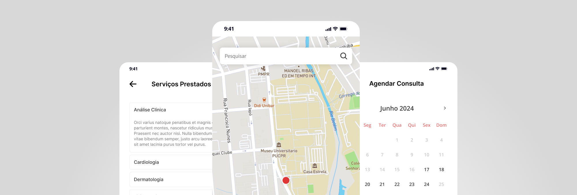
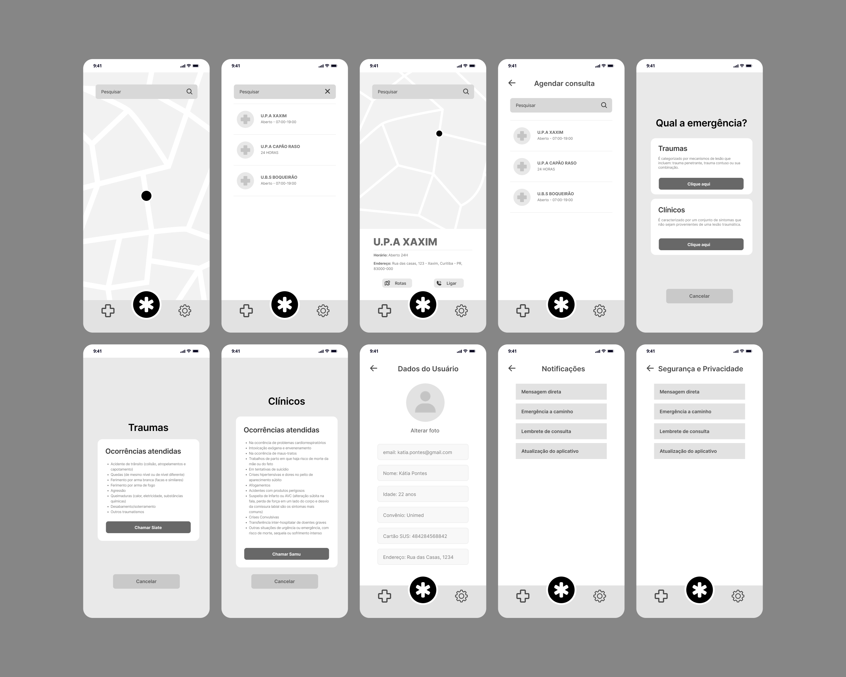
S.O.S was designed to support three main usage intents: immediate emergency, facility search, and care management. The navigation prioritizes fast decisions, minimal steps, and visual clarity.
Journeys
🚨 Emergency
The user taps the central emergency button, chooses between Trauma or Clinical cases, views example situations, and directly triggers the appropriate service (192 or 193). This flow reduces friction and enables action within seconds.
🏥 Find a Facility
The user can view nearby facilities on a map or in a list, access details such as address, 24-hour service, available services, and accepted health plans, and decide whether to go to the location or schedule an appointment. This flow helps reduce incorrect or unnecessary travel.
📅 Scheduling
Within the selected facility, the user chooses an available date and time and confirms the appointment. The history section stores previous visits, enabling continuous follow-up and care management.


Conclusion
The project revealed a clear opportunity to intervene in the early stages of the patient journey within the public healthcare system, especially at the critical moment when individuals decide which service to seek. The solution evolved from an informational concept into a multifunctional mobile application that integrates emergency guidance, facility search, and appointment scheduling.
As this was an academic project with a defined scope and timeline, the solution was not validated with end users. However, its development was grounded in interviews with healthcare professionals and a structured analysis of the patient journey, ensuring strong alignment with real and recurring system pain points. User testing would be the natural next step to validate usability assumptions, the clarity of emergency categories, and the effectiveness of the decision-making flow.
As future product developments, the next phases would include:
- Usability testing with real patients
- Validation of the information architecture
- Measurement of decision time in emergency flows
- Analysis of the impact on reducing incorrect or unnecessary travel
A potential future evolution of the product would be direct integration with emergency response systems, enabling automatic sharing of the user’s location and the classification of the incident’s severity directly through the application. This feature would expand the role of S.O.S, moving beyond guidance to become an active intermediary between citizens and emergency services.
With integrated geolocation and preliminary emergency classification, the app could reduce response time, improve initial triage, and provide more accurate information to rescue teams before they arrive on site. This evolution positions the product as a digital support layer for the healthcare system, connecting information, decision-making, and action within a single flow.
The project demonstrated that many healthcare system bottlenecks are not solely related to infrastructure, but to how users access and interpret information. By reorganizing the moment of decision, it is possible to reduce friction in care flows and generate efficiency without requiring changes to the system’s physical structure.